
Many building dashboards show everything the sensors can measure: hundreds of readings, charts and coloured dots. They impress in a demonstration and are ignored a month later, because the people running the building do not have time to interpret raw data.
A useful dashboard answers a smaller set of questions: is everything normal, what needs attention, and what should someone do about it? This guide explains how to design for those questions.
Separate status, attention and action
Organise the information in three layers:
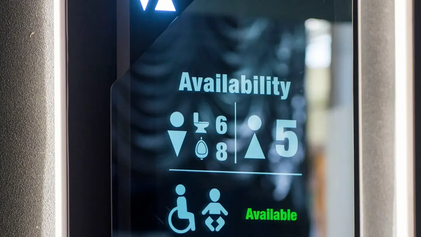
- Status: the overall picture, such as how many washrooms are available or how many devices are online.
- Attention: the few things that are not normal right now, such as a leak, an offline gateway or a cubicle occupied for an unusually long time.
- Action: what someone should do next, who should do it, and whether it has been done.
Most of the screen should be calm. The items that need attention should stand out because they are rare.
Design for each role
Different people need different views of the same building:
- Front-line staff need a short list of tasks on a phone or tablet, with locations.
- Supervisors need to see whether tasks are being completed on time.
- Engineers need device health, history and the detail to diagnose faults.
- Managers need weekly or monthly trends, not live readings.
Giving everyone the same screen usually means it suits nobody.
Show location the way people think about it
People find problems by place, not by device ID. Use floor plans, room names and the labels staff already use on site. An alert that says "Leak – Level 3, male washroom, under basin 2" is acted on faster than one that shows a device number.
Make alerts trustworthy
A dashboard is only as useful as its alerts. If staff learn that alerts are often wrong, they stop looking.
- Alert only on conditions that need a person to act.
- Group repeated events instead of sending the same alert many times.
- Show when an alert was acknowledged, by whom, and when it was closed.
- Review false alerts regularly and adjust thresholds with the operating team.
Show the health of the system itself
Sensors and gateways fail quietly. A dashboard should make it obvious when data is missing, out of date or coming from a device with a low battery. Otherwise, a blank or green screen may simply mean that nothing is being reported.
Turn data into reports people use
Trends belong in regular reports, not on the live screen. Agree a short monthly report with management, for example usage patterns, response times, recurring faults and changes since the last period, and keep its format stable so changes are easy to see.